Delivering Results with Responsive UI Layout Test Automation
November 23, 2020 | BY Sukhwinder Hanspal

With the increasing trends in the digital market, new devices and software are flooding the technology landscape. The internet is not just constrained to personal computers or laptop screens; contributing to the growth trend are mobile smartphone devices and tablets that range from a variety of screen sizes and run on various operating systems (Android, iOS, etc.).
Studies show that global mobile data traffic has grown over 18 times of what it was five years ago. This is a staggering level of growth that has been greatly boosted by advancements in fourth generation – let’s not forget the upcoming 5th gen – mobile networks and the spread of Wi-Fi. With improved access, consumers today are starting to spend more time on their easily portable smartphones than computers or laptops.
When it comes to accessing content – especially multi-media – consumers want to be able to switch to their smartphones and expect the website to function flawlessly without much hassle. They want this experience to be smooth and sophisticated. This intersection of device interchangeability and access consistency is where Responsive User Interface design comes into play.
What is a Responsive User Interface?
Responsive web pages are more user friendly than a single page which can be run only on a 1024 x 768 screen. A Responsive User Interface (UI) needs to self-adjust, or ‘respond’, according to various screen dimensions. This issue has raised the competition among various companies that need to represent their content in every way possible to deliver an optimal user experience no matter which device is used.
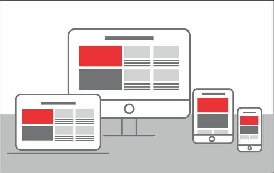
Responsive web pages adjust themselves according to the device size, orientation, browsers and OS. Responsive design concepts reduce the struggle of how the user interacts with the content being delivered on the screen irrespective of the make of the device. Different frameworks use different dimensional methodologies to create responsive web pages. Hence, there is a need to create a generic set of automated layout tests which verify the layout of the page irrespective of the framework employed.
Indeed, the use of Responsive UI design has brought in the need to validate the UI layout on various viewports so that end user experience is properly tested before releasing the application.
Responsive UI layout testing case study
A perfect example of this need for Responsive UI Layout Testing comes from a recent project with one of Bitwise’s global enterprise clients in the Media sector. The company’s end users were facing problems in easily navigating the e-newspaper app to get access to content due to the responsive nature of the app. There were several UI issues that prevented the content from being displayed properly on various viewports and these recurring issues left the end users feeling disgruntled. To resolve this and provide flawless UI experience to the end users, the client company needed to fulfil a set of criteria to ensure a responsive UI design.

Challenges of responsive UI design & testing
The company was struggling to address the following challenges that surfaced while fulfilling the criteria to ensure a flawless user experience:
- Publishing a daily newspaper with the UI showing new updates from various parts of North America along with multimedia content
- Enhancing the clarity of advertisements for the users and make them clickable along with enabling more ad revenue generation.
- Displaying menu navigation and orientation for every page on each device to enable accessibility
- Showcasing breaking news every hour as a footer
- Improving visibility of top news from every section with proper provisions to click to read the whole story
- Fixing text to eliminate overlapping at the edges as per the size of the device
- Ability to flash correct error messages in case of any issues with attractive colors used to display the messages
- Displaying good quality clear images with great visibility
- Adjusting alignment of text and images with change in orientation and screen size
- Changing colors on hovering the mouse over necessary buttons and links
- Needed a good content consumption environment which followed the rule “follow users, not devices.”
To ensure a responsive UI design, it was imperative to test the criteria for every page along with regression testing in case of some changes so that it reflects innovation as well as creativity in the design.
The client company needed an efficient solution that would enhance the responsiveness of the UI to optimize and enrich the user experience. The solution had to make the content easily visible with across diverse screen sizes and devices with optimum accessibility. This also included that advertisements placed on the content needed to be properly validated so that there is no loss of revenue leading to stakeholder dissatisfaction.
Automated responsive UI layout testing solution
Designing the solution required QA experts to come up with a well-defined and properly planned approach to chalk out the Layout Testing Automation solution.
The solution was designed and deployed using the industry best practices and an innovative approach.
This included:
- Analysing the pages with the most critical content
- Defining the viewports (Browser / Device) on which the UI needs to be validated. Using open-source API (Galen) and creation of various gspec files, which essentially include layout tests, ensuring best practices are followed
- Writing user interactions using Selenium WebDriver in the tests
- Use of single tests for both Browser and Mobile devices (Android and iOS)
- Executing these tests on Cloud Devices (Android and iOS) and Browsers
- Reporting automated test results through emails to stakeholders
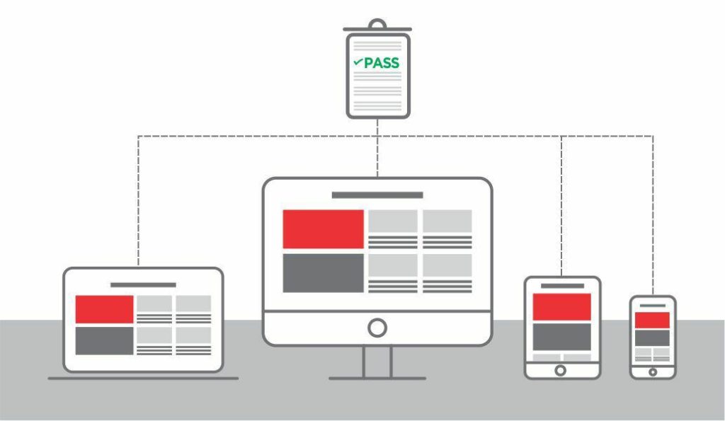
The solution approach ensured that CB (Cross-Browser) and CD (Cross-Device) Testing was aided using a cloud solution coupled with an open-source API to ensure optimum test coverage. These tests were then executed periodically during regression.
Resolving the challenges in this particular project required a customized approach towards creating an automation test suite which led to ensuring that the content and elements on the pages are displayed flawlessly over various viewports. It added value to regression testing by optimally validating the UI on various layouts after changes were done to the applications.
Increased customer satisfaction
The solution provided a complete automated responsive UI test solution that received enormously positive feedback from its users, leading to a 40% increase in ad revenues. In addition, the subscription rate increased due to the efficacious automated testing provided by a customized test suite design.
The company was able to achieve great ROI in terms of better quality and content by leveraging the right expertise and the right combination of technology solutions, leading to increased customer satisfaction.
The test suite created to identify issues on various viewports and OS was generic and easily maintainable, which reduced maintenance costs and served as a cost saver during the long run.
Having a clear vision of user experience is the key
Today, businesses have to be on their toes when it comes to effective customer interactions as they play a pivotal role in ensuring customer loyalties in an environment flooding with unlimited choices. The same goes for the state-of-the-art and intuitive UI that refines the experience of merely accessing content and information on various screen sizes or mobile devices.
The trick is to employ a deeper focus on what may hamper the end users’ experience and what can enhance it, aiming for the results that positively differentiate you from your competitors. Being proactive towards the loopholes as well as opportunities of responsive UI will eliminate the chances of losing a customer as a result of poor-quality UI.
As the world grows increasingly digital every day, focusing on how your customers are faring in their digital experience takes priority over anything and everything else. And, so does the testing for every possibility that may hinder or enhance that experience!
Relevant Case Studies
This is a center of discovery and innovation where businesses can enable themselves with the latest insights and perspectives from technology experts to stay relevant in a competitive environment.


RELEVANT Reads

Perspective | November 4, 2020
Shift-Left Testing and Overall Quality
Many professionals in the software development field have faced business problems related to technology, cost…

Perspective | October 20, 2020
Mobile App Testing Is Not The Same As...
Let us analyze this statement closely. It is indeed true that most of the organizations…

Perspective | August 28, 2020
Achieve High Website Availability across Enterprise
Website availability and platform stability are essential for any organization. Unavailability of your website can…